VitalScan
One view of two wearables, judged against your own baseline.
A dashboard for people who already own an Apple Watch and an Amazfit Helio Ring, and still get two different stories from the same body.
2025–present · Solo product designer (research, UX, UI, front end) · Figma, Next.js, Apple Health
- Health Design
- Data Visualisation
- Systems Thinking
- Multi-device
- Web App
The Problem
Wearable data is abundant and still hard to trust.
Hardware lock-in
No memory of your normal
Clinical cutoffs that ignore you
Apple Watch and a smart ring both write into Apple Health. They disagree on rest, sleep, and strain. Consumer apps either lock you into their hardware (Whoop, Oura) or show today’s numbers with no memory of your normal. Clinical thresholds treat a marathon-trained 28-year-old and a desk-bound 28-year-old as the same person.
The person who needs this suspects something is off, and they want a straight answer from the export they already have.
How I Approached It
Mapped the real sources, not the marketing ones.
Heart, HRV, sleep, and steps in Apple Health are a mix of Watch, iPhone, and ring. Treating that as one stream is how the numbers lie.
Designed against a personal band, not a clinical cutoff.
Each metric’s normal is a rolling 60-day median ± 2 robust SD. Out of band means unusual for you.
Made instrument trust a first-class screen.
Each source is graded TRUSTED / PARTIAL / DISTRUST per metric. You can read Auto, one device, or combined.
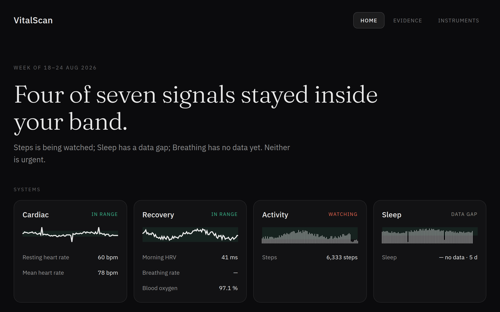
Designed home as a weekly note, not a recovery score.
Home leads with a verdict, four body systems, and findings you can open.
What I Decided, and Why
01
Personal bands over population thresholds.
A 70 bpm resting heart rate is a flag in Framingham and noise for someone whose last 60 days sat at 68.
02
Instrument grades over a silent blend.
Blending Watch and ring into one number hides the fight. Show which instrument you are looking at, and when one of them should not be trusted for that signal.
03
Evidence over a health score.
A 0–100 would make a prettier hero and imply diagnosis. Home, the 90-day bands, and the deviation map are the same idea at three depths: what changed, against what, and where it sits with everything else.
The Design
Home
- Weekly verdict, four system cards, expandable findings.
- Verdict before any number.
- Footer: organises evidence, not a diagnosis.
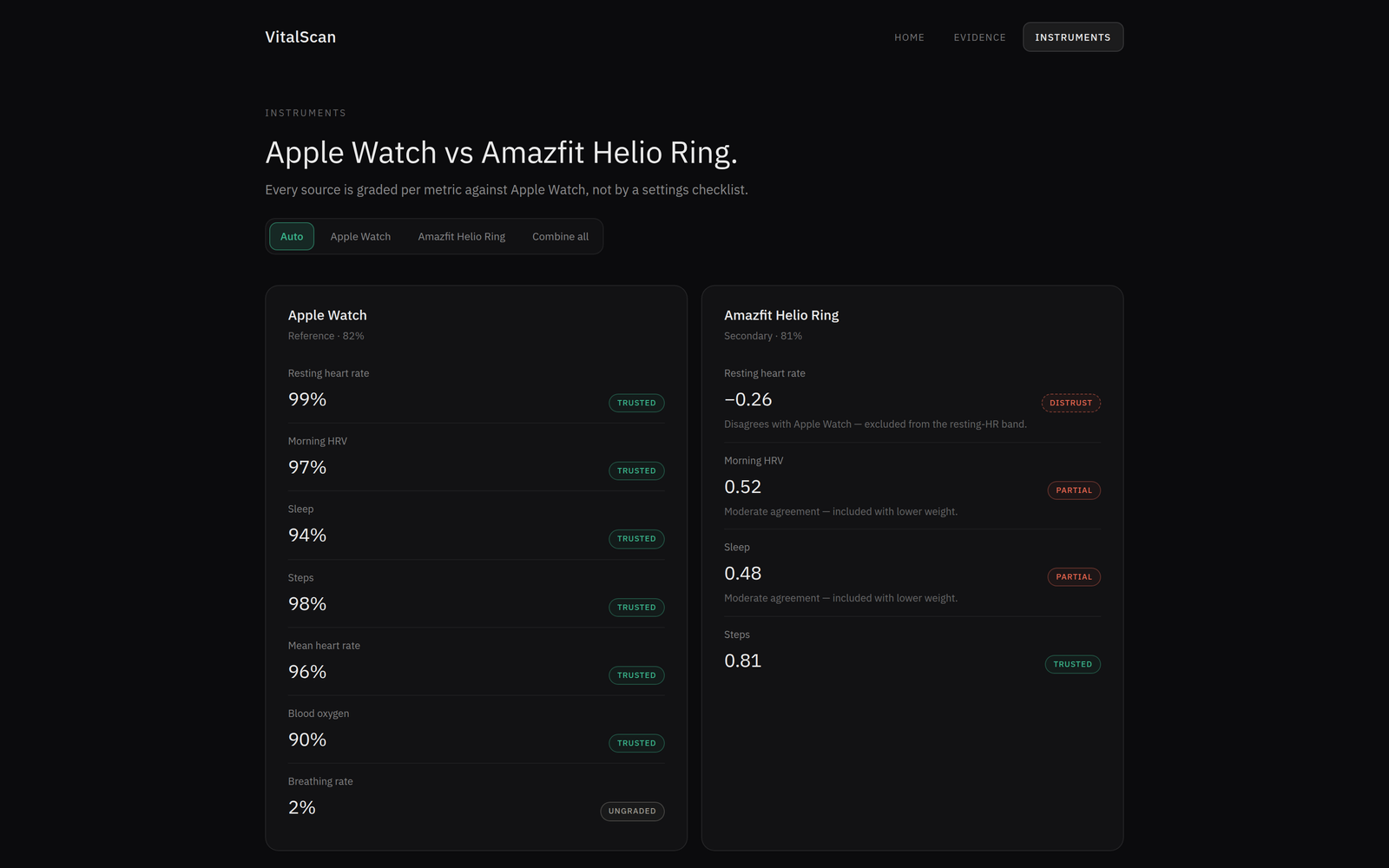
Instruments
- Amazfit Helio Ring and Apple Watch.
- Per-source trust, Auto / one device / combined.
- Two device columns, trust chips on the metric.
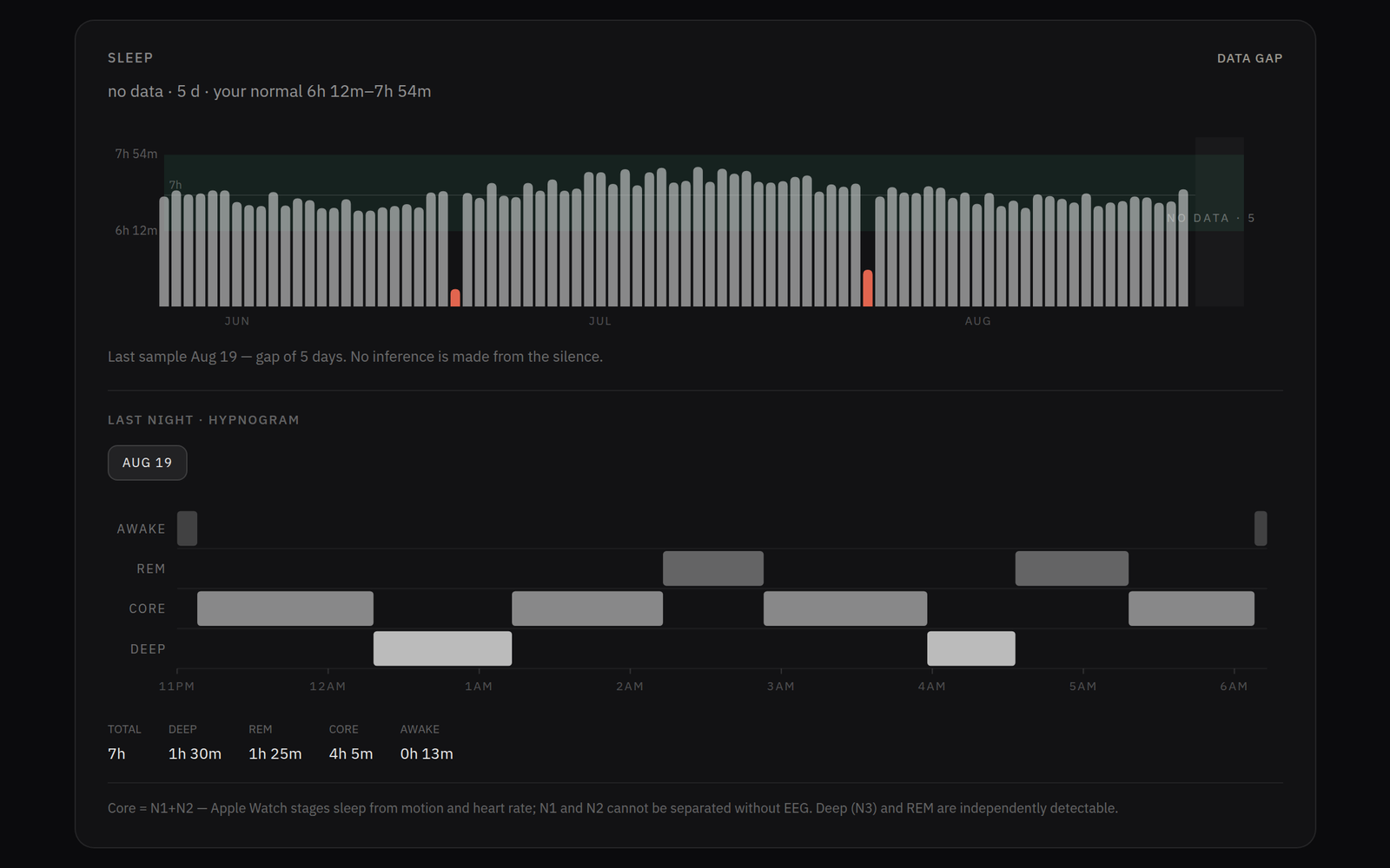
Evidence
- 90-day band charts, outliers, honest gaps, sleep against 7h.
- Most page width.
- Personal band is the story.
- 7h line sits quieter.
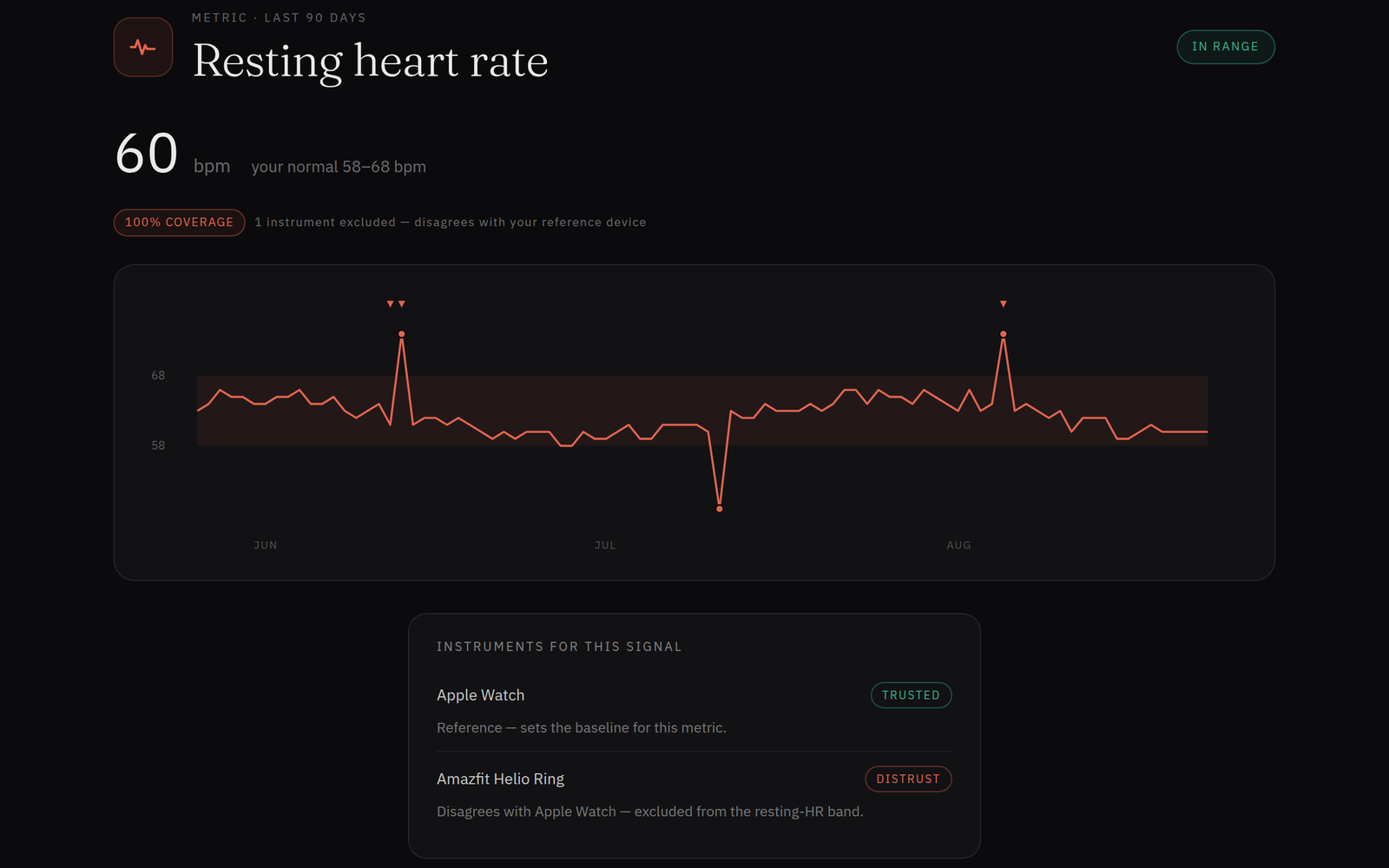
Signal
- Resting HR: the chart plus Watch TRUSTED / Ring DISTRUST.
- Instrument fight on one metric.
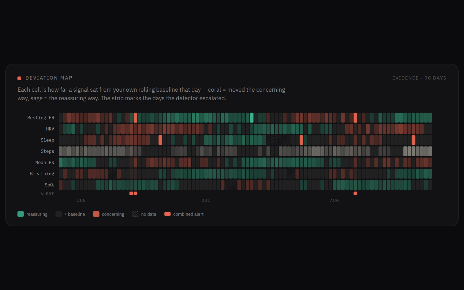
Deviation map
- The dotted z-score grid.
Outcomes
Working Next.js app. SwiftUI iOS in progress. No recruited study. The proof is the working product, and the call on what “true” means when two devices both claim to be the body.