Case Study · 2025 · 12 weeks
Grove
One app for everyone caring for the same person.
Role
UX / UI Designer
Timeline
2025 · 12 weeks
Tools
Figma
Platform
iOS · Android

Caring for an elderly person is a coordination problem as much as a medical one.
A primary caretaker manages the day-to-day. Adult children check in from a distance. A GP or specialist needs clinical context. These people rarely talk to each other in real time, and the tools they use, if they use any, don't talk to each other either. A caretaker keeps a paper medication list. A family member calls to check in and gets a vague 'she's fine.' A doctor sees a patient every few months and has no visibility into what's happened between visits. When something goes wrong, it's usually discovered late.
Existing products don't solve this. Medical alert devices like Life Alert handle emergencies but offer no ongoing health data. Consumer wearables like Apple Watch are built for individuals managing their own health, not for a care network managing someone else's. Medication apps like Medisafe address one slice of the problem. Nothing connects the whole picture.
Grove fills that gap: one app where the caretaker, the family, and the doctor each see the same patient in the format their role needs, in real time. It isn't a medical device or a wellness tracker. It's the coordination layer between the people already doing the caring.
“I only find out something's wrong when Mum calls, or worse, when the hospital does.”
One patient. Three perspectives.
The design implication of three roles is not just about permissions. It's about information density. A family member seeing the same dashboard as a caretaker would be overwhelmed. A doctor seeing the same view as a family member would be under-served. Each role required its own hierarchy of what's shown first, what's surfaced prominently, and what's hidden entirely.
The caretaker is the power user. The family member needs calm, not complexity. The doctor needs clinical rigour without the noise of caregiving logistics.
One deliberate choice: role selection happens before the patient profile is created. You pick your role, then you build the patient. This means the caretaker, the person most likely to complete the setup, naturally encounters the full onboarding first. Family members and doctors are invited in after the profile exists.
Research & Discovery
Semi-structured interviews with primary caretakers, adult children managing parents remotely, and GPs monitoring elderly patients with chronic conditions. Competitive audit across six existing products.
Role-Based Information Architecture
Mapped what each role needed to see, do, and feel. Caretaker needs full control. Family needs calm reassurance. Doctor needs clinical rigour. Same underlying data, three distinct information hierarchies.
Accessibility-First Visual Design
Atkinson Hyperlegible selected as the sole typeface. Every sizing and contrast decision flows from this. Touch targets sized explicitly for elderly motor control, not just WCAG minimums.
Prototype & Test
High-fidelity Figma prototype tested across 6 usability sessions. The medication tracking flow was iterated three times. It had the highest error rate early and zero critical errors by final testing.
The most consequential architectural decision in the project.
Showing the same data to a family member and a doctor would overwhelm one and under-serve the other. Role selection at onboarding gates access permanently. This meant designing three distinct information hierarchies for the same underlying data, a significant amount of work that most competing products have avoided by defaulting to one-size-fits-all.
iOS · Caretaker view
App entry point
Caretaker only
01
Home
02
Vitals
03
Medications
04
Appointments
05
Profile
A system built around the user, not convention
Atkinson Hyperlegible, an accessibility-first typeface
Designed by the Braille Institute specifically for people with low vision. Its defining characteristic is that every letterform is exaggerated to be distinguishable: the lowercase l and uppercase I look nothing alike. Choosing this typeface is not an aesthetic decision. It is a functional one. Two weights are used throughout: 400 for body text and 700 for headings. No other weights. No other fonts.
64px / Bold
Hero vital reading
72 bpm
36px / Bold
Page titles
Dashboard
22px / Bold
Section headers
Today's Medications
18px / Regular
Input fields
Lisinopril 10mg, take with food
14px / Regular
Secondary metadata
Last updated 2 minutes ago
11px / Bold
Nav labels / badges
NORMAL · TAKEN · VITALS
Colour palette
Deep forest green
Primary: headers, CTAs
#1B5F3A
Light green
Accent, logo fill
#93E0B1
Muted green
Subtext on dark
#A8D4B9
Success tint
Normal / Taken states
#D1FAE5
Success text
Text on success tint
#065F46
Surface
Profile screen background
#F5FAF7
Vital semantic colours
Heart Rate
Blood Oxygen
Blood Pressure
Temperature
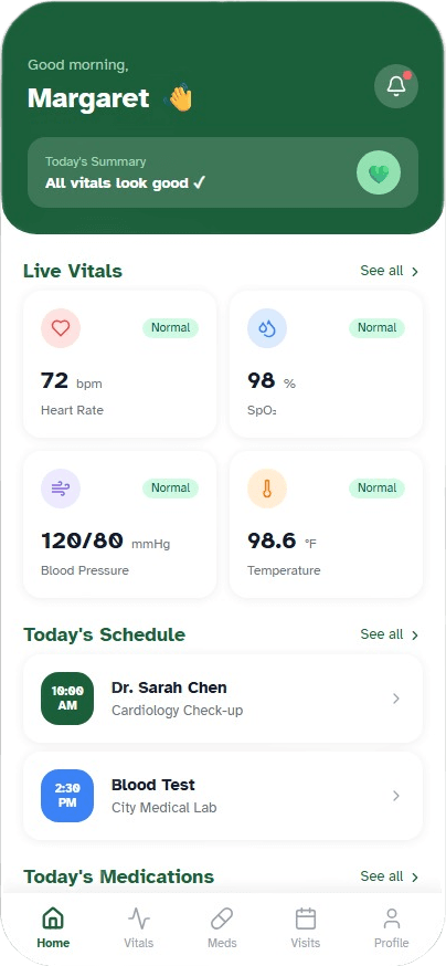
Dashboard
Everything a caretaker needs to assess the day in under ten seconds.
- Today's Summary badge gives an instant read: 'All vitals look good' or a specific alert before you read a single number
- Live Vitals 2×2 grid, each card colour-coded by vital type and tappable to the full detail screen
- Priority order: vitals, today's schedule, medications. Matched to the urgency of a morning caregiving routine
Outcomes
- ✓
6 usability sessions. All participants completed core tasks without assistance
- ✓
Medication flow iterated 3 times. Zero critical errors in final testing
- ✓
Reference range panel was the most consistently praised feature across all sessions
- ✓
Accessibility audit passed WCAG AA across all text and background combinations
Reflection
“Grove taught me that the hardest design problems are not interface problems. They are information problems. The decisions that shaped this product most were upstream of any specific screen: who are the users, what do they actually need, and what does success feel like for each of them.”
“The biggest single lesson: accessibility is architecture, not decoration. Choosing Atkinson Hyperlegible was the first decision, and it constrained every other decision downstream. If you start from the most limited user and design outward, you produce something better for everyone.”